-
Par guisthaublogs le 3 Janvier 2018 à 23:23
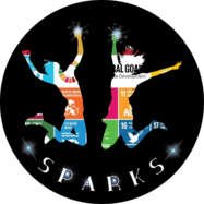
Our first task for the Sparks project was to imagine a logo ! The logo selected to illustrate the Sparks project was the lolo created by Spanish students.
It has now become the official Sparks logo.
Here are the logos suggested by the Guist'hau students, with some explanations about their choice.
Inès
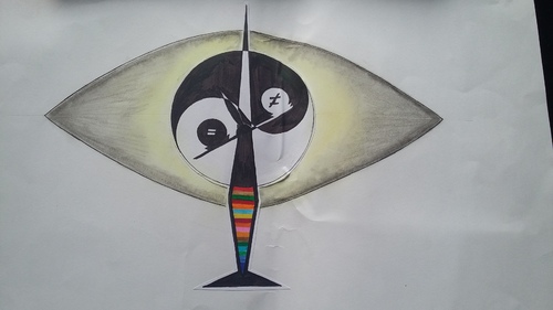
To represent the project, I draw scales meaning that we have to balance many situations in the world. There is a Yin Yang with the white point higner than the black point to represent the main goal:to make the world better than it currently is.There are seventeen colourful stripes , each one representing a goal in the project and all around there is an eye, with the Yin Yang as the pupil.The eye means that we have to look after our world, our acts, our fortune , all the problems there are everywhere.

Nina
Our logo means you can’t only watch, you must take action to stop climate change. The tree is here to show some actions are easy and apples to show a little action can help after a few years, and it means we must help the poor people to find food.
The colors : - There is some green to represent ecology and nature and green hands to illustrate the French expression "avoir la main verte", and because we don’t care about people’s color. The brown because it’s the color of the earth. - And the red because it’s the color of apple.
As regards the hands under the eyes, they mean you have to do something when you see problems in the world.
Louis and Mathieu
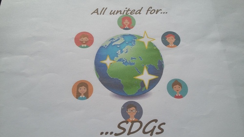
To create our logo, we chose the earth because we wanted to represent the environment . Next we put characters around the earth to represent all the classes who participate in the project and there are as many boys as girls to illustrate sex equality. Then, we chose « All united for SDGs » as a slogan because everybody can take a good action and protect the planet . Finally, the main colours of this logo are blue and green because they are the colours which best represent ecology.
Mei and Clara.
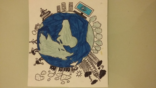
For our logo we chose three things : -
-A green earth with trees and houses to say that we are all concerned by our environment and problems on the earth.
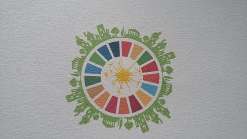
-The logo of global goals for their 17 very important goals
- Sparkles for the currency of the project and to say that we have to change.
We created this logo to show everybody that there is hope. We can all change the world, so let's try !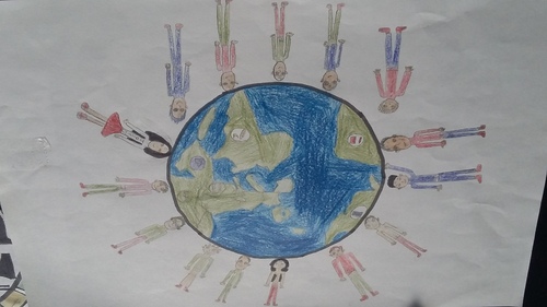
Akhmed
I chose to draw this logo because I drew different characters who come from different countries because they represent the global goals, I also drew the earth with different continents.
I chose this logo because I want everyone TO be able to eat when he is hungry whether it is for breakfast, lunch or dinner.
Then, I want everyone to be able to work in good conditions to be able to help society and to earn a good salary. Next, I want everyone to be able to be healthy, to be able to live in good conditions. I want every child to be able to go to school and to be able to develop their general knowledge in a lot of subjects to be able to find a job later and I want everyone to be able to live in a house or in a flat to be able to sleep, to be able to have breakfast with their family, to be able to have a shower.

Alice and Juliette
We have created this logo because we think the sentence "Be the sparks that changes the world” is very important and we wanted to put together all the 17 goal logos (poverty, climate action ...) We used green and blue because they are the colors of ecology. The sentence is written in a circle because it makes us think about the earth. It was very important for us that every goal and field be in our logo.
Ethann
First ,I made the choice to draw the earth in green and blue, to show how it could be whitout humans .
Next,I drew some of the problems ,or goals to reach ,AROUND the earth and not INTO it ,to represent the human expanse which is out of control. Among the problem that I chose (pollution,poverty,internet,hunger and education ),the most important to me is pollution : I represent it, whith factories , in such a way that we can see its extent . I also show the hunger in the world by drawing obese persons eating chocolate chip cookie with a very hungry man; it means that some people eat too much when others don't eat at all !
The skyscrapers show the different economy class around the world .I've represented the education by drawing books with someone sitting on them to show that some people don't even know what a book is so they sit on them as you sit on a chair .The trees are for the environment .Finally, the most noticeable colours are black and white to show the sadness of our world.

Brieuc and Louis
We chose to draw the earth with all the continents because all the peoples are ready to protect the planet.
We drew three hands, a black, a brown and a white one.They represent the whole population in the world.
All the continents are green because it’s the colour of the environment.
It means that in the future planet there is no pollution and every one has enough water and food. The sparks illustrate the idea of having a better world,
We drew seventeen sparks to repesent the global goals.

Jules and Lazslo
In our logo, two things are represented: a solar system and a target. The earth is the center of both.
First, we thought about making a solar system with the Earth as the Sun and the goals as the planets. But while making it, we thought it would be a great idea to add a cross to make it look like a target.
In the solar system, we replaced the sun with the Earth and all the different goals gravitate around it. But they aren’t placed at random : on each orbit, the goal which is the biggest is the one the others depend on. According to us, there are goals which are more important than others. That’s why we placed the goals so that the more important they are, the closer they are to the Earth.
We put a cross on the Earth to make the target. To make it look more like one, we increased the thickness of the orbits according to the importance of the goals which are on them.
For us, the important idea was to place the Earth in a central position of our “planet system” and our target, but the way it goes is totally different from reality: in real life, the planets need the sun to live, and in our logo, it’s the Earth which needs the goals to stay alive. We used the same idea for the target: in reality, we destroy the target, but here, it shows that the Earth must be what we care about. It also represents the idea that the Earth is in real danger. That’s why we mixed a planet system with a target.
And if we’ve been able to walk on the moon and to reach the stars, we should we able to save our Earth.

Pierre and Lilian
First, we looked for 4 pictures on the web : a picture of a bulb, laurel, a ribbon and a black circle. After that, we assembled these pictures we created a new unpublished picture. For us, the bulb represents the earth and a great idea, the laurel represents the success of the project and recalls the forest, the ribbon represents our school because originally Collège Guist’hau was written on it. Finally, we think the black circle represents goals and they are moving because the battle isn’t over and we must fight for this project.
 votre commentaire
-
Par guisthaublogs le 3 Janvier 2018 à 22:49
Have you heard of e-twinning?

It's a global network to connect schools and students throughout the world.
Thanks to e-twinning, we found other schools interested in joining the Sustainable Development Goals project.
On e-twinning, our project is called Sparks, because we CAN be the SPARK that CHANGES the WORLD!

So every month we have different tasks to do in order to build our project and help reach the 17 goals!
1 commentaire
-
Par guisthaublogs le 3 Janvier 2018 à 22:40
They are the 17 goals we must reach to make the world a better place. You can see the goals in the picture below!

Do you want to know more about this Unesco project? Watch the video here!
votre commentaire Suivre le flux RSS des articles de cette rubrique Suivre le flux RSS des commentaires de cette rubrique


|
|
|
|